
Material Design Components
This Components are interactive building blocks for creating a user interface.
- Installs
- 33.12K
- Measured
- Rating
- 4.3
- Ratings
- 222
- 7 reviews
- Version
- 1.2025.5
- Updated 30 Oct 2025
- Released
- 22 Feb 2020
- Tracked since 13 May 2026
- Size
- 5 MB
- Needs 4.0
Screenshots


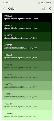
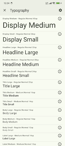


About Material Design Components
The description on the store listing
<b>M3 Catalog 🚀</b>
This app is for developer demo purposes.
<b>📚 Source Code: </b>GitHub - Material Design Components
https://github.com/boltuix-store/Material-Design-Components
<b>📖 Documentation:</b> Material 3 Guidelines 2025
https://www.boltuix.com/2025/06/material-3-guidelines-2025.html
Material is an adaptable system of guidelines, components, and tools that support the best practices of user interface design. Backed by open-source code, Material streamlines collaboration between designers and developers, helping teams quickly build beautiful products. 🌟
<b>Components 🛠️</b>
Material Components are interactive building blocks for creating a user interface. …
Read the full description
<b>M3 Catalog 🚀</b> This app is for developer demo purposes. <b>📚 Source Code: </b>GitHub - Material Design Components https://github.com/boltuix-store/Material-Design-Components <b>📖 Documentation:</b> Material 3 Guidelines 2025 https://www.boltuix.com/2025/06/material-3-guidelines-2025.html Material is an adaptable system of guidelines, components, and tools that support the best practices of user interface design. Backed by open-source code, Material streamlines collaboration between designers and developers, helping teams quickly build beautiful products. 🌟 <b>Components 🛠️</b> Material Components are interactive building blocks for creating a user interface. Here's the comprehensive list with added components: * Adaptive 🖥️: Flexible layouts for various screen sizes * App Bars: Bottom 📱: Navigation and action bars at the screen bottom * App Bars: Top 📍: Navigation bars at the top of the screen * Backdrop 🎨: Layered content with a front and back view * Badges 🔔: Badges for notifications or status on UI elements (BadgeDrawable) * Banners 📢: Temporary messages for user attention * Bottom Navigation 🧭: Switch between UI views at the bottom * Bottom Sheets ⬇️: Secondary content anchored to the bottom of the screen * Buttons 👆: Core components for triggering actions in a UI * Buttons: Floating Action Button (FAB) ➕: Floating action buttons for primary actions * FAB Menus 🔄: Menus expanding from FABs for related actions * Cards 🗂️: Display content and actions for a single subject * Carousel 🎠: Scrollable collection of items on and off screen * Checkboxes ✅: Select one or more items or toggle on/off * Chips 🏷️: Enter info, make selections, filter, or trigger actions * Data Tables 📊: Organize and display structured data * Date Pickers 📅: Select a date or range of dates * Dialogs ❗: Important prompts in a user flow * Dividers ➖: Thin lines to group content in containers * Docked Toolbar ⚓: Fixed toolbars for frequent actions * Floating Toolbar 🛠️: Dynamic toolbars for contextual actions * Icon and Segmented Buttons 🖼️: Buttons with icons or segmented options for interaction * Image Lists 🖼️: Grid or list of images * Lists 📋: Vertical lists for content display * Loading Indicators 🔄: Visual cues for short loading processes * MaterialTextView ✍️: Enhanced text display component for Material 3 * Menus 📜: Display a list of choices on a temporary surface * Navigation Drawer 📂: Switch between UI views on larger devices * Navigation Rail 🚆: Switch between UI views on mid-sized devices * Progress Indicators ⏳: Show unspecified wait times or process duration * Radio Buttons 🔘: Select one option from a set * Search Bar 🔍: Enter keywords or phrases for relevant information * Selection Controls 🎚️: Manage user selections (checkboxes, radio buttons, switches) * Sheets: Bottom 📄: Secondary content at the screen bottom * Sheets: Side 📑: Secondary content anchored to the side of the screen * Side Sheets 📘: Secondary content anchored to the side * Sliders 🎚️: Make selections from a range of values * Snackbars 🔔: Brief updates about app processes at screen bottom * Switches 🔄: Toggle the selection of an item on or off * Tabs 📑: Organize content across different screens and views * Text Fields ✍️: Allow users to enter and edit text in a UI * Time Pickers ⏰: Help users select and set a specific time * Tooltips 💡: Brief descriptions for UI elements <b>🚀 Now Available on CodeCanyon</b> Purchase the Kotlin version of Material UIX - your ultimate toolkit for crafting sleek, modern, and responsive user interfaces. Modern App Template – A Responsive and Customizable UI Kit for: * Jetpack Compose * Android Kotlin * Flutter <b>👉 Get it on CodeCanyon</b> https://codecanyon.net/user/boltuix
Installs since 29 Aug 2026 Measured
Exact Google Play install counts, collected daily
Ratings
222 ratings, 7 reviews
- 5 ★82%
- 4 ★0.0%
- 3 ★8.9%
- 2 ★0.0%
- 1 ★8.9%
Recent reviews
Latest public reviews from the store
- 10 Jan 2026
Nice app but I think there should be a thing which shows what elements are deprecated, expressive,etc. and there's always an unwanted FAB add ability to remove it.
- 25 Dec 2022
Best apk to showcase material 3. Please also add Direct links to use specific item if possible.
- 25 Oct 2022
Great demo app for Google Material Design widgets and controllable options.
- 28 Jan 2022
Amazing library. I use it all the time while developing Jetpack Compose apps!
What reviewers bring up
Topics mentioned in the latest 10 reviews, by how many reviews mention them
Liked in good reviews (9 reviews)
- material 4
- add 3
- jetpack compose 2
- specific 2
- better 2
- links 2
- demo 2
- code 2
Raised in bad reviews (1 reviews)
No topic comes up twice.
Top chart positions
Latest Google Play chart ranks by country, last 10 days
Not in any tracked top chart in the last 10 days.
Material Design Components history
Release, install milestones, listing and store changes
- Reached 10,000+ installs 26 Jul 2021
- Reached 5,000+ installs 25 Feb 2021
- Reached 1,000+ installs 4 Oct 2020
- Reached 500+ installs 15 Aug 2020
- Reached 100+ installs 8 May 2020
- Reached 50+ installs 18 Apr 2020
- Reached 10+ installs 28 Mar 2020
- Reached 5+ installs 1 Mar 2020
Update frequency
How often Material Design Components ships a new version, month by month
0 updates in the last 12 months. Less often than most similar apps: they shipped a median of 1 updates in the same year.
Recent versions
Current version 1.2025.5
- Version 1.2025.530 Oct 2025
🆕 Material Design 3 UI Updates 🐛 Firebase Bugs Fixed 🛠️ New M3 Components Added 📜 Open Source Compliance 📝 Guideline Documentation Added
- Version 1.2025.33 Jun 2025
- Version 1.13.11 Jul 2024
- Version 1.6.328 Sep 2022
Listing keywords
Words and phrases Material Design Components repeats most in its store listing
Top phrases: secondary content (4), between ui views (3), secondary content anchored (3), switch between ui (3), between ui (3).
Highlighted words also appear in the title. Counts cover the title, short description and description.
Business model and tech
From the store listing, the SDKs in the app package and its declared permissions
- Business model
- Free to download
- Built with
- No cross-platform framework or game engine detected
- Ad networks (0)
- None detected
- Sensitive access
- No sensitive permission declared
0 ad, attribution and analytics SDKs detected. SDKs are read from the app package and permissions from the store listing, so code that loads later is not seen.
Technology
28 SDKs found in the app package
2 permissions
0 special access, 0 sensitive, 2 standard
- Control vibrationStandard
- Internal app permissionDYNAMIC_RECEIVER_NOT_EXPORTED_PERMISSIONStandard
Compliance
What the listing and the app package show
- Store status
- Live
- Upkeep
- Updated 30 Oct 2025
- Registered in
- India
- Privacy policy
- Linked on the listing
- Advertising
- No ads declared
- In-app purchases
- None declared
- Age rating
- Everyone
- Sensitive permissions
- 0 sensitive of 2
- Location access
- No
- Camera and microphone
- Neither
Apps like Material Design Components
Biblia de Estudio OfflineBible app10.9K installs★ 4.81
시흥시 도서관INEK CORP.87.7K installs★ 1.6
Samsung SmartTagBoss Inc34K installs★ 3.04
وصايا الرسولteam of development7.8K installs★ 5.0
Extreme Map Bussin IndiaBrawl Game101K installs★ 4.0
Classic PC ThemeAnySoftKeyboard25.9K installs★ 5.0
Secret Codes For All MobilesDream App Studios9.2K installs★ 4.75
알라딘 전자도서관알라딘커뮤니케이션196K installs★ 2.0
Latin-American BibleHacagusae47.6K installs★ 4.59
Material Design Components: questions and answers
How many downloads does Material Design Components have?
Material Design Components has 33,124 installs on Google Play, measured from the store's own count on 16 Nov 2026.
Who makes Material Design Components?
Material Design Components is published by BOLT UIX, a developer based in IN.
When was Material Design Components last updated?
The latest version (1.2025.5) was released on 30 Oct 2025.
Is Material Design Components free?
Yes. Material Design Components is free to download.
Is Material Design Components still available?
Yes. Material Design Components is live on Google Play as of 16 Nov 2026.
Track Material Design Components and its competitors
Watch any app for new versions, rating drops, chart moves and removals. Free plan, no card.